Web
Some insights into css3 and Webkit
denvazh
When did it start?
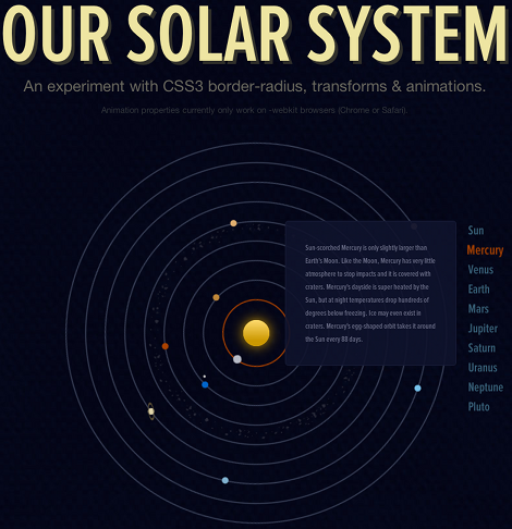
Its all started one day, when one of my friend sent me a link with a demo of css3 and its implementation in webkit based browsers:
http://neography.com/experiment/circles/solarsystem/
I was impressed with the fact, that its finally became possible to make animation in a script-like style and make browser do the rest.
After surfing the net for a while I found some interesting examples and demos using css3.
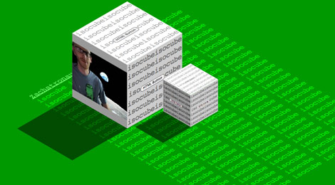
The Cube
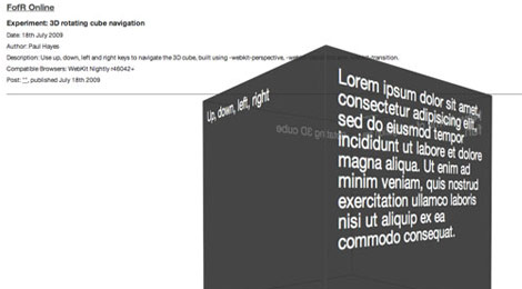
Check this link for a demo: http://www.fofronline.com/experiments/cube-3d/
In this demo you are allowed to move 3d cube with arrow keys. Impressive, isn’t it?
Though, as its still in an under development state, you should directly point to the scripts your want use to process you css3 code:
<link rel=”stylesheet” type=”text/css” href=”http://sources.fofronline.com/css/experiments.css” />
<script type=”text/javascript” src=”http://ajax.googleapis.com/ajax/libs/prototype/1.6.0.3/prototype.js”></script>
How to use it?
First design style layout in a css3 way. In the code snippets below you might find properties starting with -webkit:
#experiment {
-webkit-perspective: 800;
-webkit-perspective-origin: 50% 200px;
}
#cube {
position: relative;
margin: 0 auto;
height: 400px;
width: 400px;
-webkit-transition: -webkit-transform 2s linear;
-webkit-transform-style: preserve-3d;
}
That were general properties for the cube. But cube consist of 6 faces and it also necessary to set styles for them. Below is a general settings for face of the cube.
.face {
position: absolute;
height: 360px;
width: 360px;
padding: 20px;
background-color: rgba(50, 50, 50, 0.7);
font-size: 27px;
line-height: 1em;
color: #fff;
border: 1px solid #555;
-webkit-border-radius: 3px;
}
Please note, that it is now possible to set colors in a rgba way, i.e. red, green, blue and alpha channel. If alpha channel value can be set in a range from 0 to 1, where 0 is absolutely transparent, and 1 is non-transparent. In this case value is 0.7, so as a result you can see the cube, but at the same time you can see through it as well.
Next it is necessary to set faces positions:
#cube .one {
-webkit-transform: rotateX(90deg) translateZ(200px);
}
#cube .two {
-webkit-transform: translateZ(200px);
}
#cube .three {
-webkit-transform: rotateY(90deg) translateZ(200px);
}
#cube .four {
-webkit-transform: rotateY(180deg) translateZ(200px);
}
#cube .five {
-webkit-transform: rotateY(-90deg) translateZ(200px);
}
#cube .six {
-webkit-transform: rotateX(-90deg) rotate(180deg) translateZ(200px) ;
}
That’s it for styles. Now cube you made a cube, but you can only see it from one viewpoint. To see all faces it might be necessary to rotate it. In this case its can be done with a Javascript. It listens to keydown event, changes values accordingly and then use $(‘cube’).style.webkitTransform to submit new coordinates so that cube would rotate.
<script type=”text/javascript”>
var xAngle = 0, yAngle = 0;
document.addEventListener(‘keydown’, function(e)
{
switch(e.keyCode)
{
case 37: // left
yAngle -= 90;
break;
case 38: // up
xAngle += 90;
break;
case 39: // right
yAngle += 90;
break;
case 40: // down
xAngle -= 90;
break;
};
$(‘cube’).style.webkitTransform = “rotateX(“+xAngle+”deg) rotateY(“+yAngle+”deg)”;
}, false);
</script>
Now the code, which describes graphical part and actual behavior of the object, is complete to some extent, and the only thing to do is to initialize object, i.e. define the div containers with necessary content and corresponding object references as show below:
<div id=”experiment”>
<div id=”cube”>
<div class=”face one”>
One face
</div>
<div class=”face two”>
Up, down, left, right
</div>
and etc.
Other Examples
Similar to previous example – Mulitcubes
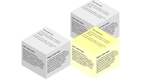
and many-many other examples you can find here:
http://www.webdesignerwall.com/trends/47-amazing-css3-animation-demos/
As you have seen, this is very interesting and promising approach, which has all chances to change the face of the Internet in a long-run.
 2025/12/12
 2024/09/13
 2024/05/17
 2023/07/14
 2023/03/24
 2022/11/18
 2022/10/07
 2022/09/16