開発
Usage of SIMILE Widgets (Timeplot) for Web Visualization
yilang
When ones’ mind got lost in the data explosion (whether large or abstract), web visualization, using graphic web technology, can help make the data easier to read or learn. In the field of visualization, time plotting is typical for visual learning, here we introduce an open source tool, the SIMILE Timeplot, to visualize the invisible environment data measured by sensors.
1. Introduction
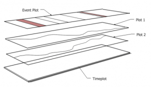
Timeplot is a DHTML-based AJAX widget for plotting time series and overlay time-based events over them. Obviously, we can find out that it is designed around the concept of layered plots, see to the Figure of Timeplot Design.
Moreover, each plot needs two geometries (there are vertically aligned value geometry, and horizontally aligned time geometry within each plot) that take care of mapping the time and value coordinates to the screen coordinates. Regarding to the consistency, the multi-layered time plots should be configured to share the same time geometry.
2. Practice
It is NOT so complex getting start with Timeplot, since there are many easy-understanding tutorials or demos available on-line. Therefore, the main work concentrates onto the IO operations, especially for the automatic data visualization in real time.
The Timeplot only supports the input from the formatted file which is accessible via hyperlinks; thus it would be reasonable to make that file as pipe between the Timeplot and data source.
Taking the Mark2 Geiger Counter for example, it tweets the measured radiation data onto Twitter. A crawling script, which importing the data from the Twitter, could enable the Timeplot data file as a pipe between Timeplot and data source.
1) There are three gems (rubygems, twitter and active_resource) required
#!/usr/bin/env ruby
require 'rubygems'
require 'twitter'
require 'active_resource'
2) It is also in need of Twitter authorization
# see to http://dev.twitter.com/apps
Twitter.configure do |config|
 config.consumer_key = ""
 config.consumer_secret = ""
 config.oauth_token = ""
 config.oauth_token_secret = ""
end
3) Crawling the data from Twitter into the formatted file
Since the frequency of the data is high regarding to the long-term measurement, therefore, we part the data stream into different dates based on time. See to the image of Timeplot demo below, it is microSievert in vertical line, and time in horizontal line.
while true do
  # initialize file name
  time = Time.new ;
  file_path = "/radiation/" + time.strftime("%Y-%m-%d") + ".txt" ;

  # extract and format the data from Twitter
  str_tweet = Twitter.home_timeline.first.text ;
  arr_tweet = str_tweet.split(",") ;
  rd_date, rd_time, rd_cpm, rd_usv = str_tweet.split(",") ;

  rd_date = rd_date.strip.gsub("/", "-") ;
  rd_time = rd_time.strip ;
  rd_cpm = rd_cpm.strip.gsub("cpm", "") ;
  rd_usv = rd_usv.strip.gsub("uSv", "") ;

  # export the formatted data into the formatted file
  if (file_path)
    aFile = File.new(file_path, "a+", 0644) ;
    aFile.write(rd_date + " " + rd_time + "," + rd_usv + "," + rd_cpm + "\n") ;
    file_path = nil ;
    aFile.close ;
  end

  # take pause since the data is discrete from the original data source
  sleep 5*60 ;
end
4) Importing the data from the pipe (Timeplot data file)
Flow the tutorial here, and identify the file path of the pipe.
var currentTime = new Date() ;
var curmonth = ("0" + (currentTime.getMonth() + 1)).slice(-2) ;
var curdate = ("0" + (currentTime.getDate())).slice(-2) ;
timeplot_radiation = Timeplot.create(document.getElementById("timeplot-radiation"), plotInfo_radiation);
timeplot_radiation.loadText("/radiation/"+currentTime.getFullYear()+"-"+curmonth+"-"+curdate+".txt", ",", eventSource);
3. Conclusion
In this study, we practice the demo of Timeplot for to visualize the real-time data stream. Of curse there are other much more fantastic open source tools for data visualization, for instance DATAVISUALIZATON.CH; however, because of the high-level encapsulation of the tools, the main development work is mashing up the data rather than using the tool itself. Secondly, a good data visualization is user-friendly with a clear view to the meaning of the data, do help people to understand.


 2026/03/06
 2025/12/12
 2024/12/06
 2024/09/13
 2024/05/17
 2024/05/10
 2024/01/05
 2023/08/18