デザイン
So ordinary, so small, so necessary: computer icons.
Mola BogdanGeorgii
Some time ago I have interesting talk about concept that stay behind so familiar “save” icon.
For most IT guys, the meaning of “save icon – floppy diskette” should be very obvious. But let’s consider it from younger generation’s point of view. In particular children could understand that button will save their drawing (for example) or some current progress. Will they be able to explain what is it? That is why there arise interesting inference: original meaning of icon does not reflect real action that performed in modern process. It is just established way of interaction with user interfaces. Obviously we could ask the following question: “What should we use instead?” It is not so easy to answer, especially for person out of this specialization (me, for example). I would like to share the following considerations, summarize it and hope to make some inferences.
Not just little pictures on screen.
Laynin somewhere between art, science and psychology, icons itself became regular part of our life significant time ago. We just use them without extra efforts. We didn’t attach importance to them. For people involved in computer related work icons are as usual as using of light switch. But some time ago it was serious issue to design appropriate way to interact with some technology. This issue has ubiquitous context (Not only computer icons and signs). Indeed, it does not matter how good your technology if there are no convenient and understandable way to interact with it. Especially in case of mass production technology for people without technological education (I could say for any people outside particular developers group). Design of interaction methods in the past seems to be quite challenging. Speaking about past, it is fine to note that even in our days it is possible to see changes and evolution. So called “burger” icon become very ubiquitous icon for menus. Form and color may vary but you definitely recognize it.
There was some discussions about this icon in world of design, some thinks that it is anti-pattern and there can be better and more exquisite alternatives. Possible reason of such rejection is using of “burger” as indicator for drag and drop style changing of order in list items icon or alignment. In my humble opinion different meaning of the same icon in different context can be nice argument for designers who supports “burger” icon. No matter who was right today this icon appears in websites, mobile applications, mobile games and mobile websites. Icon seems to be really convenient when we there is lack of space.
In comparison with save icon there are no any physical relationship with object or process. It is just abstract thing. Is there are another types of icons? Of course yes. As in every sphere there are different opinions and approaches. As little theoretical injection I would like to list 4 types proposed by Yvonne Rogers (the director of the Interaction Centre at University College London and a professor of Interaction Design).
- Resemblance icons that represents direct link with functionality or task. For example icon for smartphone camera application or Google Calendar application (Example below).
- Exemplar icons reflects whole set of ideas and helps indicate complex things. For example, icon for drawing application that contain pencil as the most frequently used tool.
- Symbolic icons has more abstract meaning. For instance fragile sign on parcel. In context of IT worth to mention earth globe that represents idea of connection with world for internet.
- Arbitrary icons without logical connection with object or concept. For example on/off sign or “burger” icon mentioned above.
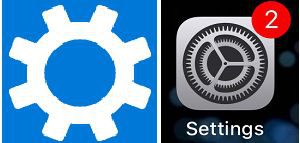
Speaking about save icon, I could say that it belongs to Resemblance and Symbolic type because it reflects particular process that has weak association with current one. As we can see, in this example once established some icons can persist long time. It is just mechanism of our consciousness: to associate well know things to new phenomena. Brighter example is gear that indicates invocation of settings and adjustment options in computers.
If diskettes was part of computer (computer from the modern point of view) reality, it hard to say the same about gears. So it is hard to say is it necessary to replays diskette icon. Some people underline importance of adding text (pop-up text) for new icon. In one hand computer icon is technical tool that has standards that serves well like gear or “burger”. In other hand, icon part of visual language. And any language grows and evolve.


 2023/12/15
 2023/07/07
 2023/04/28
 2022/10/07
 2022/03/04
 2021/01/29
 2020/09/18
 2020/01/31